Wednesday, June 1, 2011
RR04
Chapters 9 and 10 of Design: A Very Short Introduction talk a lot about deign in the business world. It is stated that not many designers work just for themselves, but rather for a larger employer or industry. This bigger owner has the power to call the shots with the direction they want their design for the company to go in. I especially found it interesting where Haskett mentioned that some companies prefer long-term design as opposed to short-term design. I personally appeal to long-term design because I think it has the most impact over the years. In the book, they mention Mercedes continually using the the same type of style car and same logo so that their brand and design remains timeless. Yet I could see the approach of a company like GM wanting to have several different short-term designs (Chevy, Buick, Cadillac) in order to appeal to consumers across the board with different model changes. In international companies such as McDonalds, it was interesting to learn that they use design when thinking about the delivery, preparation and environment of their franchises; not simply just the product. When you have a multibillion dollar world-wide company like McDonalds it is not a surprise that this is the only way to make sure their original design and creative approach to business sticks. The tenth chapter of Haskett's book goes on to talk about the future of design; which seems both exponentially opportunistic yet extremely uncertain. With some companies, such as Sony, entire strategic design groups are hired specifically to work on design and report back to the president of the company. Yet when thinking of the rest of the world, how will we ever know how advanced countries besides the US will be? Haskett mentions that China already has a firewall which enables its citizens to go to websites outside their governments limitations. Design in order to help third world countries has caught on as well. I thought the design by Angelo Garay and Andrea Humeres was complete genius and actually reminded me a lot of the coleman products we were designing in class. The packaging on the lightbulb they sent out to poor rural homes could be reused as a lampshade, where usually these homeowners did not even own shades of any kind. It is a big question over all where the future of design will go, but it seems that big companies here in the US are realizing the impact of design. Consumer sales increase when design is incorporated. As with other countries, design will always have an opportunity to flourish when discovering the more simplistic needs of the citizens in these countries.
J10
Design 200 has been quite the growing experience for me. I came in to this class thinking about pursuing a design minor, but was nervous as hell to get back into the creative world after being away from it for so long. Not only has this class been an easy transition for me, but it has opened my eyes to many more interests of mine that I never knew about before this class. I have rediscovered my genuine love for nature and sustainability. I have a new passion for environmental design. The day we learned about Biomimicry I was so interested that I still talk about to this day to my friends and family. Design 200 taught me to not be afraid. To speak up and share my ideas. It taught me that making a mistake is a positive experience and will only help to get you to your final product. I learned to never fear your original intuition. Most of all I learned that design is everywhere. Designers never stop designing and the world and our society is full of spaces and objects that are always seeking new designs. There were times in this course where I felt intimidated and slightly overwhelmed by the ideas and work of fellow students, but in turn I realized it only helped me grow. Having the opportunity to create my own blog posts and then browse my classmates helped the class have a much more open and comfortable environment. I especially enjoyed how throughout the quarter the class was pretty much an on your own type deal, but that we had to keep in touch with our card groups. I never felt alone, and knew I had three personal contacts in case I ever had a question or needed help. Ending the quarter with a project combining all of our efforts was the cherry on top. I feel ready for my next design course, and I am no longer afraid to pursue a minor in design. I am extremely grateful I decided to take Design 200 as my first actual design class here at Ohio State; it was relaxing, informative and taught me new foundations within the art world while giving me the opportunity to share ideas with my peers in the same boat as me.
CR05
In the last few days of class I had the opportunity to see the other groups presentation and I was simply amazed. Even though my team and I had been working hard for two weeks putting together a product for the Coleman home line, I had no idea what to expect from my other classmates. I was amazed! It seemed like everyone had come up with such different and innovative ideas. I think what I was most impressed with were the products that were very technologically advanced or were more fit for our electronic generation. The app for the ipod touch was an awesome idea and I loved the visuals, it looked like something I could easily download today. I thought it was a unique approach to the project because it seems like everyone has some sort of smart phone or hand held device that has apps and the fact that this app was from the Coleman brand and helped you save energy was so cool. I also loved the wireless device that hooked up to the curtains which used solar power to power the wireless outlet. That product involved so much sustainability yet still took into account the needs of today's generation (being wireless) and applied to something everyone needs in their day to day life. I especially liked that they made little mock-up mini versions of the product so as a class we could have a hands on idea of what exactly they were imagining. The last project that really struck me was the oven-top party table. It was fun, functional and super sellable. The graphics that their group put together were so hi-tech and amazing it seemed like I could log online and buy the product today. Not only were their graphics awesome, but they explained all the technology behind how the oven would function and how it runs. It was very impressive to see how much thought and time they put into their product and made sure to not leave one point out. I also enjoyed how a few groups created a completely new logo for their new product, where some groups just recreated the old Coleman logo. I thought that was a great idea to show that this specific product could become so popular it could have its very own logo. Overall, I was shocked by the amount of teamwork and creativity that came together for the home goods line. Personally, I think Coleman would have been pretty impressed with our presentations.
Tuesday, May 31, 2011
J09
For the Coleman project, I worked with my teammates Audra, Payton and David. I had a wonderful time working each week with them, brainstorming and bouncing ideas off one another. I felt like we were all extremely open and not shy to put any idea on the table when trying to think of a successful product for the Coleman Home Goods line. We knew we wanted a product that would be fit for someone our age, 19-23, who was living in tight quarters and going through some sort of transition in life. We all shared how living in either a dorm or a small apartment can be difficult with storage and on our wallets. I think we all thought something in the kitchen would be Coleman's best transition product, and the first tool that came to mind was the Swiss Army knife. It is an object that many Coleman campers commonly use because it is compact, portable, usable in multiple ways and affordable. After Payton came up with the name, Ustemsils, we knew we could get pretty creative with out product.
We wanted the packaging to be 100% reusable so we decided to make the top and bottom pieces magnetic hooks that would store our product, and then outer "box" part would be a foldable cutting board. Each package would come with one main "stem" or handle, and 5 separate attachment heads. We brainstormed many different useful kitchen utensil heads, but settled on a ladle/cup measure, sauce spoon, whisk, spatula, and pasta strainer/drainer. Our Kiosk and logo sort of went hand in hand. We changed our logo form a lantern to a house so that Coleman users would still recognize and be familiar with the logo, but realize without the lantern it was the home goods side to the company. Our kiosk had a house shape as well, with branches to represent the light beams, coming off the side where our product was placed on display.
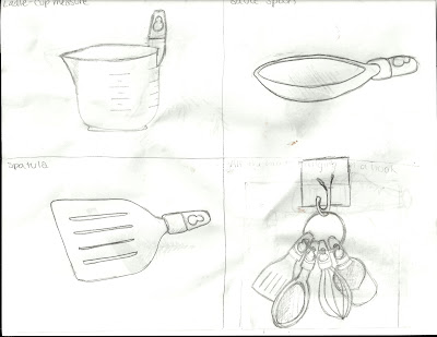
I decided to take on the role of sketching and pulling the entire project together and creating a Presi. I had the easiest time envisioning the attachment heads and how they would store on the hook which would be attached to the fridge. I drew the spatula, sauce spoon, ladle/cup measure and then a picture of them all togther on a hook hanging. The Presi presentation was my first ever, and although it was extremely cool and way better than powerpoint, it took me quite some time to get used to! I also realized after watching the other presentations there are many more effects I could have used I didn't know about. I am happy I decided to do the presentation on Presi though, because it creates a cleaner, more hi-tech presentation and gives you a lot more creative freedom than a typical powerpoint.
We wanted the packaging to be 100% reusable so we decided to make the top and bottom pieces magnetic hooks that would store our product, and then outer "box" part would be a foldable cutting board. Each package would come with one main "stem" or handle, and 5 separate attachment heads. We brainstormed many different useful kitchen utensil heads, but settled on a ladle/cup measure, sauce spoon, whisk, spatula, and pasta strainer/drainer. Our Kiosk and logo sort of went hand in hand. We changed our logo form a lantern to a house so that Coleman users would still recognize and be familiar with the logo, but realize without the lantern it was the home goods side to the company. Our kiosk had a house shape as well, with branches to represent the light beams, coming off the side where our product was placed on display.
I decided to take on the role of sketching and pulling the entire project together and creating a Presi. I had the easiest time envisioning the attachment heads and how they would store on the hook which would be attached to the fridge. I drew the spatula, sauce spoon, ladle/cup measure and then a picture of them all togther on a hook hanging. The Presi presentation was my first ever, and although it was extremely cool and way better than powerpoint, it took me quite some time to get used to! I also realized after watching the other presentations there are many more effects I could have used I didn't know about. I am happy I decided to do the presentation on Presi though, because it creates a cleaner, more hi-tech presentation and gives you a lot more creative freedom than a typical powerpoint.
When we decided we wanted to make the packaging all reusable, I mentioned the hook and cutting board idea and didn't think it would fly. When the group liked it, I was both surprised and pleased! I basically laid out any and all ideas that came to my head, so I think that helped in making the others more comfortable about just saying what they felt. With group projects I feel it works best to keep the environment very comfortable, someone could have a great idea but does not have the nerve to bring it up. I also liked to not let an idea die. If someone brought something to the table, I tried to work with it or rework it until we had something that would be a good contribution to our project. The only thing I think I could have done better is maybe elaborate more on our product. When we finally got it down, we could have talked more about materials, drawn maybe more intricate sketches, and also talked about colors. Other than that, I liked that our group kept it simple yet practical so Coleman users could have an affordable and easy to use home goods product.
Wednesday, May 25, 2011
Monday, May 23, 2011
CR 04
The past two weeks in Design 200, we have been working strictly on our Coleman projects. It has been very challenging but also very fun and inspiring. The design our group came up with really got us all excited and brainstorming like crazy. I think we came up with so many ideas we hardly knew what to do with all of them and how to incorporate each one. Once we decided on our final result, at times it was difficult to throw away ideas and stick to the simple ones that we actually needed. I truly like our product and how it relates to a product that Coleman consumers probably already use in the camping world. For me, Coleman is so synonomous with camping and the simplistic nature of the outdoors, that I knew our product had to be similiar to this mindset. Our product the ustemsil, is extremely similar to the Swiss-Army knife. The idea behind the Swiss-Army knife is that within one compact little unit you get multiple uses. That is the same thought process we had with the ustemsil. I liked how my group had the ability to create packaging that reusable and smart, yet still small in size. The Coleman project as a whole has been a fun and intriguing topic. I like that our indoor product has to be transformed for the indoors, yet keep the same audience. Throughout Design 200 we have been learning about product design and how to make things better and how to make packaging reusable; now that we had the opportunity to actually create something with a group was awesome. I think our product is innovative and unique and I am very excited to present it to the class!
J08
Design and the Environment
I have always been a nature buff. I love to camp, bike, run, hike and do anything outside at all times. When deciding on a major at Ohio State, I always wanted to combine something with the environment. I never knew how much design could have an effect on our earth ecological system. After learning more about nature and how it effects design through the videos we watched in class on biomimicry, I have realized how much these two aspects of art and science can intermix. Although our environment is spuratic and natural, with design we can help create more sustainable products, create a more livable earth, and help the nature that exists flourish.
Source 1: Landscape Architecture
http://knowlton.osu.edu/?content=18
The video on this website is the source that I particularly was interested in. Landscape architecture is not simply designing the backyards of wealthy homeowners; it is a sustainable and "green" occupation that helps create highways, cities and park landscapes so that they are more environmental. I was amazed with the work landscape architects do. They design things such as green roofs, which are rooftops on buildings that are made of grass so that the rain collects in the soil and in turn helps keep the building cool while prevents run off. They create highways so the chemicals and residue from cars do not build up in our ecosystem. They design neighborhoods and specifically place trees in areas surrounding the houses that will help save the homeowners energy. Landscape architecture is a specific career that incorporates both the environment and design in every aspect.
Source 2: Green Design Furniture
http://www.greendesigns.com/
Green design furniture is an awesome company. Not only are their pieces of furniture gorgeous and extremely appealing, they leave a very small environment footprint. They selectively cut the trees they use for their wood so that the rebirth of younger trees is faster and more easier for the forests. They make sure their products are durable and last for generations, yet the design is fairly simple and not extreme so that the style is also timeless. All of their products are derived from reused material and they generate hardly any "waste" in their factories. They care so much about the quality and ecological well being of each one of their products that they produces less than 1,000 pieces of furniture each year.
Source 3: Design By Nature
http://www.designbynature.org/main.php
Design By Nature is a very unique graphic design firm. They understand that in general, graphic design is not the most eco-friendly specialization. It involves a lot of printing, ink, paper and material waste. Their goal is to make their graphic designs more sustainable and reduce their carbon footprint. They do so by using environmentally responsible paper, reusable packaging and bio-friendly ink. Their company is based in Australia and is the only graphic design firm known in that country. They understand that in today's world, a graphic designer has the capability of designing a well thought out, and creative design, while also using less material, causing less environmental impact and while costing less. If everyone supported this type of idea with graphic design firms, there would be more publicity for going green and more support for designers who understand and care for sustainability and our ecosystem.
Source 4: Mama's Earth
http://www.mamasearth.com/
Mama's earth is the one of the main "green general stores" on the internet. It provides consumers with all sorts of organic and environmentally safe products. All of their house ware products such as glass plates and bowls are made from 100% recyclable glass, while their linens and bed throws are 100% organic cotton. The more heavy-duty products such as wallets or tote bags are made of all natural hemp. This was the only store online that seemed to have products across the board from kids products to accessories to items for the home. It is affordable and good for the environment. These type of products (shirts, socks, etc..) could be easily bought or produced more affordably for stores such as wal-mart or target, but the design of Mama's Earth products are specifically created to help keep all their inventory more eco-friendly and durable.
Source 5: Environment Design
http://www.environmentdesign.com/
I thought this company was very cool. Although it may seem childish, I know as a kid I was outside from the early morning until dinner time. I truly believe being in nature as a kid helps you appreciate and care for the outdoors exponentially more than the kids who are stuck inside playing video games. The fact that this company not only creates playgrounds for youngsters that fit in the environment more naturally and comfortably than the stereotypical bright plastic pieces, but they are also made of 100% recyclable materials. Their products can take the wear and tear of the changing seasons' weather, and are able to last up to 15 years longer than the standard leading brand with barely any upkeep. These products not only are safe and reliable, but help teach children how important nature is through imagination and play.
Subscribe to:
Posts (Atom)