Wednesday, June 1, 2011
RR04
Chapters 9 and 10 of Design: A Very Short Introduction talk a lot about deign in the business world. It is stated that not many designers work just for themselves, but rather for a larger employer or industry. This bigger owner has the power to call the shots with the direction they want their design for the company to go in. I especially found it interesting where Haskett mentioned that some companies prefer long-term design as opposed to short-term design. I personally appeal to long-term design because I think it has the most impact over the years. In the book, they mention Mercedes continually using the the same type of style car and same logo so that their brand and design remains timeless. Yet I could see the approach of a company like GM wanting to have several different short-term designs (Chevy, Buick, Cadillac) in order to appeal to consumers across the board with different model changes. In international companies such as McDonalds, it was interesting to learn that they use design when thinking about the delivery, preparation and environment of their franchises; not simply just the product. When you have a multibillion dollar world-wide company like McDonalds it is not a surprise that this is the only way to make sure their original design and creative approach to business sticks. The tenth chapter of Haskett's book goes on to talk about the future of design; which seems both exponentially opportunistic yet extremely uncertain. With some companies, such as Sony, entire strategic design groups are hired specifically to work on design and report back to the president of the company. Yet when thinking of the rest of the world, how will we ever know how advanced countries besides the US will be? Haskett mentions that China already has a firewall which enables its citizens to go to websites outside their governments limitations. Design in order to help third world countries has caught on as well. I thought the design by Angelo Garay and Andrea Humeres was complete genius and actually reminded me a lot of the coleman products we were designing in class. The packaging on the lightbulb they sent out to poor rural homes could be reused as a lampshade, where usually these homeowners did not even own shades of any kind. It is a big question over all where the future of design will go, but it seems that big companies here in the US are realizing the impact of design. Consumer sales increase when design is incorporated. As with other countries, design will always have an opportunity to flourish when discovering the more simplistic needs of the citizens in these countries.
J10
Design 200 has been quite the growing experience for me. I came in to this class thinking about pursuing a design minor, but was nervous as hell to get back into the creative world after being away from it for so long. Not only has this class been an easy transition for me, but it has opened my eyes to many more interests of mine that I never knew about before this class. I have rediscovered my genuine love for nature and sustainability. I have a new passion for environmental design. The day we learned about Biomimicry I was so interested that I still talk about to this day to my friends and family. Design 200 taught me to not be afraid. To speak up and share my ideas. It taught me that making a mistake is a positive experience and will only help to get you to your final product. I learned to never fear your original intuition. Most of all I learned that design is everywhere. Designers never stop designing and the world and our society is full of spaces and objects that are always seeking new designs. There were times in this course where I felt intimidated and slightly overwhelmed by the ideas and work of fellow students, but in turn I realized it only helped me grow. Having the opportunity to create my own blog posts and then browse my classmates helped the class have a much more open and comfortable environment. I especially enjoyed how throughout the quarter the class was pretty much an on your own type deal, but that we had to keep in touch with our card groups. I never felt alone, and knew I had three personal contacts in case I ever had a question or needed help. Ending the quarter with a project combining all of our efforts was the cherry on top. I feel ready for my next design course, and I am no longer afraid to pursue a minor in design. I am extremely grateful I decided to take Design 200 as my first actual design class here at Ohio State; it was relaxing, informative and taught me new foundations within the art world while giving me the opportunity to share ideas with my peers in the same boat as me.
CR05
In the last few days of class I had the opportunity to see the other groups presentation and I was simply amazed. Even though my team and I had been working hard for two weeks putting together a product for the Coleman home line, I had no idea what to expect from my other classmates. I was amazed! It seemed like everyone had come up with such different and innovative ideas. I think what I was most impressed with were the products that were very technologically advanced or were more fit for our electronic generation. The app for the ipod touch was an awesome idea and I loved the visuals, it looked like something I could easily download today. I thought it was a unique approach to the project because it seems like everyone has some sort of smart phone or hand held device that has apps and the fact that this app was from the Coleman brand and helped you save energy was so cool. I also loved the wireless device that hooked up to the curtains which used solar power to power the wireless outlet. That product involved so much sustainability yet still took into account the needs of today's generation (being wireless) and applied to something everyone needs in their day to day life. I especially liked that they made little mock-up mini versions of the product so as a class we could have a hands on idea of what exactly they were imagining. The last project that really struck me was the oven-top party table. It was fun, functional and super sellable. The graphics that their group put together were so hi-tech and amazing it seemed like I could log online and buy the product today. Not only were their graphics awesome, but they explained all the technology behind how the oven would function and how it runs. It was very impressive to see how much thought and time they put into their product and made sure to not leave one point out. I also enjoyed how a few groups created a completely new logo for their new product, where some groups just recreated the old Coleman logo. I thought that was a great idea to show that this specific product could become so popular it could have its very own logo. Overall, I was shocked by the amount of teamwork and creativity that came together for the home goods line. Personally, I think Coleman would have been pretty impressed with our presentations.
Tuesday, May 31, 2011
J09
For the Coleman project, I worked with my teammates Audra, Payton and David. I had a wonderful time working each week with them, brainstorming and bouncing ideas off one another. I felt like we were all extremely open and not shy to put any idea on the table when trying to think of a successful product for the Coleman Home Goods line. We knew we wanted a product that would be fit for someone our age, 19-23, who was living in tight quarters and going through some sort of transition in life. We all shared how living in either a dorm or a small apartment can be difficult with storage and on our wallets. I think we all thought something in the kitchen would be Coleman's best transition product, and the first tool that came to mind was the Swiss Army knife. It is an object that many Coleman campers commonly use because it is compact, portable, usable in multiple ways and affordable. After Payton came up with the name, Ustemsils, we knew we could get pretty creative with out product.
We wanted the packaging to be 100% reusable so we decided to make the top and bottom pieces magnetic hooks that would store our product, and then outer "box" part would be a foldable cutting board. Each package would come with one main "stem" or handle, and 5 separate attachment heads. We brainstormed many different useful kitchen utensil heads, but settled on a ladle/cup measure, sauce spoon, whisk, spatula, and pasta strainer/drainer. Our Kiosk and logo sort of went hand in hand. We changed our logo form a lantern to a house so that Coleman users would still recognize and be familiar with the logo, but realize without the lantern it was the home goods side to the company. Our kiosk had a house shape as well, with branches to represent the light beams, coming off the side where our product was placed on display.
I decided to take on the role of sketching and pulling the entire project together and creating a Presi. I had the easiest time envisioning the attachment heads and how they would store on the hook which would be attached to the fridge. I drew the spatula, sauce spoon, ladle/cup measure and then a picture of them all togther on a hook hanging. The Presi presentation was my first ever, and although it was extremely cool and way better than powerpoint, it took me quite some time to get used to! I also realized after watching the other presentations there are many more effects I could have used I didn't know about. I am happy I decided to do the presentation on Presi though, because it creates a cleaner, more hi-tech presentation and gives you a lot more creative freedom than a typical powerpoint.
When we decided we wanted to make the packaging all reusable, I mentioned the hook and cutting board idea and didn't think it would fly. When the group liked it, I was both surprised and pleased! I basically laid out any and all ideas that came to my head, so I think that helped in making the others more comfortable about just saying what they felt. With group projects I feel it works best to keep the environment very comfortable, someone could have a great idea but does not have the nerve to bring it up. I also liked to not let an idea die. If someone brought something to the table, I tried to work with it or rework it until we had something that would be a good contribution to our project. The only thing I think I could have done better is maybe elaborate more on our product. When we finally got it down, we could have talked more about materials, drawn maybe more intricate sketches, and also talked about colors. Other than that, I liked that our group kept it simple yet practical so Coleman users could have an affordable and easy to use home goods product.

Wednesday, May 25, 2011
Monday, May 23, 2011
CR 04
The past two weeks in Design 200, we have been working strictly on our Coleman projects. It has been very challenging but also very fun and inspiring. The design our group came up with really got us all excited and brainstorming like crazy. I think we came up with so many ideas we hardly knew what to do with all of them and how to incorporate each one. Once we decided on our final result, at times it was difficult to throw away ideas and stick to the simple ones that we actually needed. I truly like our product and how it relates to a product that Coleman consumers probably already use in the camping world. For me, Coleman is so synonomous with camping and the simplistic nature of the outdoors, that I knew our product had to be similiar to this mindset. Our product the ustemsil, is extremely similar to the Swiss-Army knife. The idea behind the Swiss-Army knife is that within one compact little unit you get multiple uses. That is the same thought process we had with the ustemsil. I liked how my group had the ability to create packaging that reusable and smart, yet still small in size. The Coleman project as a whole has been a fun and intriguing topic. I like that our indoor product has to be transformed for the indoors, yet keep the same audience. Throughout Design 200 we have been learning about product design and how to make things better and how to make packaging reusable; now that we had the opportunity to actually create something with a group was awesome. I think our product is innovative and unique and I am very excited to present it to the class!
J08
Design and the Environment
I have always been a nature buff. I love to camp, bike, run, hike and do anything outside at all times. When deciding on a major at Ohio State, I always wanted to combine something with the environment. I never knew how much design could have an effect on our earth ecological system. After learning more about nature and how it effects design through the videos we watched in class on biomimicry, I have realized how much these two aspects of art and science can intermix. Although our environment is spuratic and natural, with design we can help create more sustainable products, create a more livable earth, and help the nature that exists flourish.
Source 1: Landscape Architecture
http://knowlton.osu.edu/?content=18
The video on this website is the source that I particularly was interested in. Landscape architecture is not simply designing the backyards of wealthy homeowners; it is a sustainable and "green" occupation that helps create highways, cities and park landscapes so that they are more environmental. I was amazed with the work landscape architects do. They design things such as green roofs, which are rooftops on buildings that are made of grass so that the rain collects in the soil and in turn helps keep the building cool while prevents run off. They create highways so the chemicals and residue from cars do not build up in our ecosystem. They design neighborhoods and specifically place trees in areas surrounding the houses that will help save the homeowners energy. Landscape architecture is a specific career that incorporates both the environment and design in every aspect.
Source 2: Green Design Furniture
http://www.greendesigns.com/
Green design furniture is an awesome company. Not only are their pieces of furniture gorgeous and extremely appealing, they leave a very small environment footprint. They selectively cut the trees they use for their wood so that the rebirth of younger trees is faster and more easier for the forests. They make sure their products are durable and last for generations, yet the design is fairly simple and not extreme so that the style is also timeless. All of their products are derived from reused material and they generate hardly any "waste" in their factories. They care so much about the quality and ecological well being of each one of their products that they produces less than 1,000 pieces of furniture each year.
Source 3: Design By Nature
http://www.designbynature.org/main.php
Design By Nature is a very unique graphic design firm. They understand that in general, graphic design is not the most eco-friendly specialization. It involves a lot of printing, ink, paper and material waste. Their goal is to make their graphic designs more sustainable and reduce their carbon footprint. They do so by using environmentally responsible paper, reusable packaging and bio-friendly ink. Their company is based in Australia and is the only graphic design firm known in that country. They understand that in today's world, a graphic designer has the capability of designing a well thought out, and creative design, while also using less material, causing less environmental impact and while costing less. If everyone supported this type of idea with graphic design firms, there would be more publicity for going green and more support for designers who understand and care for sustainability and our ecosystem.
Source 4: Mama's Earth
http://www.mamasearth.com/
Mama's earth is the one of the main "green general stores" on the internet. It provides consumers with all sorts of organic and environmentally safe products. All of their house ware products such as glass plates and bowls are made from 100% recyclable glass, while their linens and bed throws are 100% organic cotton. The more heavy-duty products such as wallets or tote bags are made of all natural hemp. This was the only store online that seemed to have products across the board from kids products to accessories to items for the home. It is affordable and good for the environment. These type of products (shirts, socks, etc..) could be easily bought or produced more affordably for stores such as wal-mart or target, but the design of Mama's Earth products are specifically created to help keep all their inventory more eco-friendly and durable.
Source 5: Environment Design
http://www.environmentdesign.com/
I thought this company was very cool. Although it may seem childish, I know as a kid I was outside from the early morning until dinner time. I truly believe being in nature as a kid helps you appreciate and care for the outdoors exponentially more than the kids who are stuck inside playing video games. The fact that this company not only creates playgrounds for youngsters that fit in the environment more naturally and comfortably than the stereotypical bright plastic pieces, but they are also made of 100% recyclable materials. Their products can take the wear and tear of the changing seasons' weather, and are able to last up to 15 years longer than the standard leading brand with barely any upkeep. These products not only are safe and reliable, but help teach children how important nature is through imagination and play.
Monday, May 16, 2011
J07
Wow! My classmates had some very original and cool found letters. I particularly liked David and Erica's letters. David's descriptions and letters were unique and quirky. I liked that he found letters that were much more difficult (like S) compared to the typical O and T. Erica's were from objects I could have used myself, such as headphones, but did not even think of! Also the way she took the picture, cropped it, and put it in black and white made it really easy to actually see the letter instead of having to look for it within the photograph. When discussing the past few classes, I liked Corey's take on the subject of Girl Talk. I completely agree with her and the fact that Gregg is creating a collage of music from the past. Although he is using other pieces, his work is still innovative and new. Payton's point on copyrights and infringement was interesting when she discussed Michael Jackson's dance moves. To audiences and fans alike, his moves seemed unique and strictly his own. Little did we all know some choreographer actually created them for him and was upset and MJ was getting all the credit. When does the copyrighting battle go too far? It seems like this will remain a difficult and somewhat unanswered question. On the other hand, Audra brought up a great point when comparing plagiarism to copyrighting. If we all think what Girl Talk is doing is allowable, then how come we have to cite so many sources in our papers and can not just copy and paste? But still, I think there is a fine line there. Gregg Gillis is not simply copy and pasting, he is reusing and creating.
RR03
Cradle to Cradle is such a unique and innovative book that continues to amaze me. To compare what our civilization has done over the past hundred or so years to today environmentally and ecologically is amazing and at times, even disturbing. I liked the point McDonough made about reusing our products. The idea that during the Great Depression and WWI, as a nation humans saved and reused objects such a jars, jugs and aluminum foil. This concept of reusing everyday, ordinary objects seems so far fetched from the plastic and tupperware products we use today. My take is that during the war or the depression we were so concerned about reusing these items because of the thought of saving our dollar. We did not do this because it was environmentally sound, or helped keep the waste in our landfills to a minimum. We did it because a jar made of glass was so expensive, we kept the jar washed it out and reused it instead. Today this concept seems ridiculous. The boom of the industrial revolution made these products much cheaper to produce, it became less profitable to save something compared to buying something new. In this day and age, if something durable, such as a toaster or oven were to break, we would simply throw it "away". I think about this and it makes me sick to my stomach. Why do we all have this backwards way of thinking? Why do we as a society only think about convenience or affordability before the environment? Will our ways of thinking ever change or reverse order?
Which brings me to my next interesting observation. There is no away. Humans do not have the capability to actually throw their waste somewhere, it must go some place. And the only scary part about all of this waste is not the growing amount of it in the landfills, but rather the valuable material in the landfills that is completely lost. I think the concept of "waste equals food" to be extremely interesting and one hundred percent true. If we are just throwing away products and materials that could easily be turned into something new or refurbished there is no point to just be adding to the already monstrous landfill and creating more. Another fact I found astonishing was the number of chemicals in normal household products. For example McDonough mentioned the television having 4,360 chemicals, some of those chemicals even being toxic. Yet it is amazing to read that innovators as far back as Henry Ford thought to reuse their shipping containers for their product. I was shocked to read that the crates that shipped the Model A trucks became the vehicle's floor boards. How innovative! Especially for his time. Today, only a few producers are just now getting back into the groove of reusing products like Ford did in his shipping equipment. What took so long and why did innovative and ecological design ever stop? The nomadic cultures had it right. Once you use a bit of land, you need to re-cultivate it and let it regrow. They barely ever wasted. Whatever designers or producers create in today's world, needs to somehow be able to give back. It needs to be reused, recreated or refurbished. We need to stop believing that there is a place called "away".
Which brings me to my next interesting observation. There is no away. Humans do not have the capability to actually throw their waste somewhere, it must go some place. And the only scary part about all of this waste is not the growing amount of it in the landfills, but rather the valuable material in the landfills that is completely lost. I think the concept of "waste equals food" to be extremely interesting and one hundred percent true. If we are just throwing away products and materials that could easily be turned into something new or refurbished there is no point to just be adding to the already monstrous landfill and creating more. Another fact I found astonishing was the number of chemicals in normal household products. For example McDonough mentioned the television having 4,360 chemicals, some of those chemicals even being toxic. Yet it is amazing to read that innovators as far back as Henry Ford thought to reuse their shipping containers for their product. I was shocked to read that the crates that shipped the Model A trucks became the vehicle's floor boards. How innovative! Especially for his time. Today, only a few producers are just now getting back into the groove of reusing products like Ford did in his shipping equipment. What took so long and why did innovative and ecological design ever stop? The nomadic cultures had it right. Once you use a bit of land, you need to re-cultivate it and let it regrow. They barely ever wasted. Whatever designers or producers create in today's world, needs to somehow be able to give back. It needs to be reused, recreated or refurbished. We need to stop believing that there is a place called "away".
Monday, May 9, 2011
CR03
These past two weeks, I have really enjoyed the material being covered in class. First and for most, I love love loved the Girl Talk video. I thought it was incredibly interesting and so, unbelievably cool. I have been a fan of Girl Talk for awhile now and to see Gregg in his natural environment and teaching his audience how he creates his music and where he gets his ideas from was amazing. On top of that, the whole world of copyrighting and stealing music was a topic that I kind of understood but had always wanted to learn more about. It completely shocked me. All the restrictions put on not only musicians but illustrators and other artists as well is unreal. It seems like in today's society it is nearly impossibly to come up with something original without having to copyright someone else's work. One of my favorite artists, Radiohead, was also brought up in the video. Their album, In Rainbows, was released to the public essentially for free, and consumers were allowed to say how much they wanted to pay for it. I remember "buying" this album and wondering why they would ever do such a thing. After watching this video on copyrights and legal issues within the music business it all makes sense. Both Gregg Gillis and the creator of the video prove a great point, we are all constantly remixing and reworking old pieces of work to recreate something new. The last shocking part of this film for me was the restrictions Disney put on all creations after his own. I was a huge Disney fan, but that type of ownership seems not only unfair but illegal.
Besides the video, the speakers from Design Circle and Cobego were awesome! Even though I am only thinking about minoring in design and they mainly talked about getting through the design major, it was still such a help to hear what they had to say. The most inspiring part for me was actually the fact how many times they changed their mind. I feel like I wake up everyday with a new idea or career path that feels better for me, and when I heard them all talk about how many years it took for them to decide and how many different majors they switched out of I felt a huge feeling of relief. I enjoyed Design Circle's discussion of trying again until you get what you want, and going with your first instinct. The guys from Cobego made me realize your first idea is not always the best and your first instinct may always be wrong. After hearing from these speakers, I feel a lot better (and less stressed) about my decisions within the Design Minor and even with my other academics in school.
Besides the video, the speakers from Design Circle and Cobego were awesome! Even though I am only thinking about minoring in design and they mainly talked about getting through the design major, it was still such a help to hear what they had to say. The most inspiring part for me was actually the fact how many times they changed their mind. I feel like I wake up everyday with a new idea or career path that feels better for me, and when I heard them all talk about how many years it took for them to decide and how many different majors they switched out of I felt a huge feeling of relief. I enjoyed Design Circle's discussion of trying again until you get what you want, and going with your first instinct. The guys from Cobego made me realize your first idea is not always the best and your first instinct may always be wrong. After hearing from these speakers, I feel a lot better (and less stressed) about my decisions within the Design Minor and even with my other academics in school.
J06
Links to 5 sites that specialize in camping equipment:
http://www.coleman.com/
http://www.cabelas.com/
http://www.rei.com/
http://www.theglamcampingcompany.com/
http://www.llbean.com/
3 Images of exhibition/trade show booths from the outdoor and recreational sporting industry:


What is an Indoor Home Good?
-A home good is a product that is not a always a necessity, but an appealing object bought for the home that is functional, fits well within the interior of the home and is sometimes stylish. For example a home good could be a couch, utensils, or a lamp.
3 Images of Home Goods


http://www.coleman.com/
http://www.cabelas.com/
http://www.rei.com/
http://www.theglamcampingcompany.com/
http://www.llbean.com/
3 Images of exhibition/trade show booths from the outdoor and recreational sporting industry:


Links to 5 manufacturers or retailers who specialize in indoor home goods products:
3 images of trade show / exhibition booths from the indoor home goods market


-A home good is a product that is not a always a necessity, but an appealing object bought for the home that is functional, fits well within the interior of the home and is sometimes stylish. For example a home good could be a couch, utensils, or a lamp.
3 Images of Home Goods


Sunday, May 8, 2011
A04

H- Found in the fence in the side of my yard.

(lowercase) r- found on a pipe attached to my house in the backyard

Z- Found in the elastic binding to a lounge chair in my front yard

E- Found in a shutter on the back of my house

S- Found in a desk lamp on my computer desk

P- Found in a metal, wire holder for my mother's dishes that are on display

A- Found in a basket in my family room

Y- Found in a huge painting that hangs in our hallway

X- I found this one in the legs to a side table on my back patio

L- This letter is formed by the arm and back to the rocking chair on my front porch

F- I found this letter in the windowpanes to a door on my garage

T- This letter I found on the little lamp that sits on top of our piano.

V- This last one is simple, and I found it in a tree in my yard!
Monday, May 2, 2011
RR02
In chapter seven of John Heskett's book, Design, I was intrigued by the importance of global design amongst nations throughout the world. We all see items or flags that represent countries or cultures but we never stop to think why is it that this certain product makes me think of the UK? For example, I loved the story on the bright red telephone kiosks. I know I have seen these growing up, and automatically think of London or Paris, but definitely not a city in the United States. Eventually these kiosks got replaced with more efficient, plain glass phone kiosks and the UK became outraged. The nostalgia of the old, red kiosks had held so much symbolism and were some sort of identity for the UK that their disappearance caused an uproar. The original creator of the red kiosk never thought his initial design would hold so much power and identity, but that is magnitude of success design can have. BP's logo change was another fascinating topic. I can remember the old BP logo, and passing it everyday in the middle of my hometown. Yet sometime in the past ten years, the simple image for BP changed to one that involved a little green and yellow sun like design. This was all a move to prove that BP was becoming more "sustainable" and eco-friendly. With the changing times come changing logos, companies will do what they have to do to make consumers believe their products are changing for the better. I think it is so bizarre that I did not even realize the BP logo has changed, yet before I was completely used to the old sign. As a consumer, I had allowed the company to change its look and I have accepted the change in appearance easily.
Cradle to Cradle is already a very intriguing book. Right off the bat I was intrigued by the way he mentioned everything in a common household that is full of toxins and chemicals. Although it made me a little disturbed and uncomfortable to know the chair I was sitting on could be housing many unhealthy ingredients, it was amazing to understand that the materials in our daily lives contain so many unnatural components. Even the "recyclable environmental" carpet had ended up using more energy to create, by forcing odd materials together that normally do not mesh, than the standard "non environmental" carpet. Environmental design in the '70s and '80s was a shocking subject as well. It is funny to think back then the only environmental design known to our culture was adding some solar panels to an already fairly ugly and poorly laid out design. The pages of the book also struck me. Right away I felt how they were thicker and harder to turn. I knew the topic of what they were made from would be brought up, and I was shocked to learn they were more reusable than typical paper from the trees. Their hard, plastic-y feel was actually more sustainable and reusable than the thin, brittle paper we are normally used to.
Cradle to Cradle is already a very intriguing book. Right off the bat I was intrigued by the way he mentioned everything in a common household that is full of toxins and chemicals. Although it made me a little disturbed and uncomfortable to know the chair I was sitting on could be housing many unhealthy ingredients, it was amazing to understand that the materials in our daily lives contain so many unnatural components. Even the "recyclable environmental" carpet had ended up using more energy to create, by forcing odd materials together that normally do not mesh, than the standard "non environmental" carpet. Environmental design in the '70s and '80s was a shocking subject as well. It is funny to think back then the only environmental design known to our culture was adding some solar panels to an already fairly ugly and poorly laid out design. The pages of the book also struck me. Right away I felt how they were thicker and harder to turn. I knew the topic of what they were made from would be brought up, and I was shocked to learn they were more reusable than typical paper from the trees. Their hard, plastic-y feel was actually more sustainable and reusable than the thin, brittle paper we are normally used to.
J05
When going through my peer's blogs this past week, I have noticed many interesting and similar points in all of their responses. Audra brought up a great point when comparing our design lecture to a story she read in her Women's Studies class that was written by a disabled woman. I liked how she realized the design aspects we were learning about in the video to make life easier for disabled people were crucial and necessary for many disabled citizens. I loved how Payton brought up the reusable water bottle. I had almost completely forgot about it! I also loved that design and thought it seemed so straight forward that I was shocked it had taken this long to invent. I agree with Patyon in wondering where all the toxins and dirt go? The water was obviously clean and filtered but the dirt could not possibly just disappear...right? David and I had a lot of similar faces. We both noticed knobs or buttons on objects that could create eyes, drawer type things that pop out of shelves, but many of his faces were so creative! I loved his belt smile, and the washer machine one. I would never think to turn my camera and take a picture sideways, lining it up with the side panel of a doorway to create a smiley. How creative!
Sunday, April 24, 2011
A03
For the scavenger hunt, I worked with fellow Jack, Payton F-L. Our other two "Jack" friends worked with us as well, and we all brainstormed and helped rotate taking pictures.
Clue 1

This is me snoozin on a Barcelona chair in the Knowlton Library. The designer of the Barcelona chair is Mies van der Rohe and Lilly Reich. I found it interesting that the chair was designed based off of the folding chairs in the ancient times. It became known to have a reputation "worthy of the kings".
Clue 2

Here is Payton reading a Harvard Design Magazine in the Pastil Chair designed by Eero Aarino. We liked this chair right away because of its smooth, round shape and bright eye-catching color. This chair is made of fibreglass and therefore is a great outdoor chair since it can not be ruined by the weather. It can also float on water!
Clue 3

Here is a picture of Audra and I high-fiving (because it was our final picture) in front of the Wexner Center, which was designed by Peter Eisenman. The large white metal grid outside of the Wexner center is supposed to represent the street grids of campus and Columbus. I thought that was both extremely interestingly and probably something few people actually know.
Clue 4

This is a photo of Audra and Payton standing in front of the Science and Engineering Library. This library was designed by Phillip Johnson. I was surprised this was a building that had one of our "clues" attached to it, but once I noticed the seemingly sky-high arches and over all open walkway appeal, I now have greater appreciation for the SEL. The description of Johnson's work in New York city match the height and enormousness of these arches.
Clue 5

Here is Payton touching the very top of the Thompson Library! This building was a design by Acock & Associates. The library was built in three phases and the goal of the designers was to combine modern, Second Italian Renaissance revival and stacked level design. It took only three years to renovate but 30 to originally build.
CR02
I have LOVED the videos we have been watching the past two weeks in class! Where to start? The shopping cart video completely amazed me. I thought they were putting way too much effort and though into something as simple as a shopping cart. But once I saw the final design and what each part of the model represented, it was awesome. The way they worked around the entire cart being a useful thing to steal, and how they created the removable baskets so you could travel through the skinny aisles without getting in the way was so incredible. I really liked how they ran their office as an open thinking environment where goofing off and crazy ideas were welcome and even encouraged. This past week though, the environment and design videos were simply inspiring. I have always been a huge nature buff and love anything and everything that is working to support a greener lifestyle and help planet earth. The video on Biomimicry taught me so much about where product design, architecture and technologies today are going! I loved the idea that nature, with all its complex systems and organs, can run smoothly and functionally and still survive. So why not model our own designs off their natural creations? The bug that lived in an environment with no water, but collected the molecules from fog off of its body to turn into drinking water was something I had never learned or heard about before. But the fact that designers are working to create entire buildings to do this type of water collection for a city of humans is fascinating. The other mimicry I liked was the shark. The evolution of his skin and having the uneven pattern of diamonds which helps him stay sanitary and disinfect himself from the constant flow of bacteria, which in turn designers have now mimicked in hospital floors too battle the use of antibacterial sprays which are becoming less effective. All the inventions and ideas at the environmental TED conference were outrageously cool.
J04

This smiley face I happened to see when passing the magnetic calender on my fridge. The two circle magnents (one representing a family member's birthday) happened to sit above a smudged line from a note that my mom had written but got partially erased.

This face I found on the center piece on my dining room table. I like how its nose is connected to its eyes and it has a huge smile.

This one is hard to see at first but once you see it, it almost looks like a dog face. I found it on the fridge as well.

This face looks like a little robot face to me. It is a timer for the easter lights my mom had hanging across our kitchen window.

This one is a bit of a stretch, but I noticed it unintentionally when getting lost in one of my sister's paintings we have hanging in our family room. I kept looking at all the circle designs and smiley faces started popping out everywhere to me!

These baskets hold shoes in my family room but if you look closely, you see a sort of block-head "monsterish" face.

Simple, yet obvious. This little face on every outlet I notice every time I plug something in. He looks frightened.

Another one that is somewhat of a stretch but I couldn't help taking a picture! It is a frowning face, but the sugar and cream containers along with the edge of the center table cloth on my kitchen table looked like a sad but colorful face to me.

This one is extremely goofy. It is a clay pot I made in first grade and at the time had just drawn and placed random clay chunks and designs everywhere. When I passed it on display in my mom's office I noticed a cooky little face on the side.
Sunday, April 17, 2011
Assignment 02
Milton Glaser- Short Bio

Milton Glaser very well may be one of the most simplistic and straightforward designers to ever make it famous. Although his name is not nationally recognizable or particularly well-known, one of his pieces is distinguishable worldwide. The "I Love NY" symbol is a creation of Milton Glaser's and is just one of his many iconic graphic designs. Glaser attended the High School of Music and Art in New York and furthered his education at the Academy of Fine Arts in Italy. In 1958 Glaser became a founder and later a president of Push Pin Studios. In 1968, Glaser became the co-founder of New York Magazine along side Clay Felker. Along with his noteworthy logo design, Glaser also designed the famous Bob Dylan poster and the "DC bullet" logo.
Glaser is best known for being authentic, uncomplicated and direct. He works with various mediums and multiple styles and has been known to use or work with anything to get the message across to the viewer. He is seen as one of history's most hard working graphic designers and has won multiple awards from distinct establishments such as the Art Directors Clubs, the American Institute of Graphic Arts, and the Society of Illustrators. Glaser designs everything form advertisements to book covers to drawings and illustrations in newspapers or magazines.
What intrigued me the most about Glaser was how easy his work seems but how difficult I know it had to be to come up with. The "I Love NY" symbol does not even seem like something that would need to actually be designed and up until this day I had no idea it actually even had a designer attached to it. The more I think about it, the more it makes sense. Its simple, eye-catching and laid out in a such a way that it can be used on t-shirts, coffee mugs and various other usable and wearable consumer products. Only a strategic and communicative designer could come up with a design that could become that outrageously popular and spread like rapid fire.


Works Cited:
"Milton Glaser Biography and Artwork - MetroArtWork." MetroArtWork - MetroArtWork. Web. 17 Apr. 2011. <http://metroartwork.com/milton-glaser-biography-artwork-m-218.html>.
"Milton Glaser - Biography." RoGallery.com - Online Auctions & Select Artworks Online. Web. 17 Apr. 2011. <http://rogallery.com/Glaser_Milton/Glaser-bio.htm>.
"Google Images." Google. Web. 17 Apr. 2011. <http://www.google.com/images?hl=en>.
Nate Duval - Short Bio

Nate Duval is a poster artist for many popular, alternative bands today such as Phish, Broken Social Scene, Wilco and Spoon. Growing up a huge music fan, Duval sees this artistic outlet as the closest he can get to being a rock-star. Although that career goal never seemed to work out, it was always a dream of his to make it in the music world. With album covers and CD art becoming an obviously less needed artistic field, promotional band posters for both new songs and music tours are becoming all the rage. Along with these posters come fan memorbilia such as t-shirts and bumper stickers which contain the same poster art.
The posters that Duval design are usually a limited edition, created specifically for the release of an artist or band's latest project. Since the posters are limited editions, they are a lot more likely to be considered collectors items by fans. This also means that the posters are a lot more intricate in design and work, and take a unique and creative twist by the artist that will specify the image to the work of music by the musician. With music being so quick and available to listeners via the internet and programs such as iTunes, the artwork that consumers used to see coincide with the music is almost lost with the advancement of technology today. Which is why these hip, trendy and visually appealing posters are a huge outlet for artists to get their piece of the puzzle shown in the music business shown.
What I enjoyed most about Duval's work was the uniqueness of his field in the artistic genre and how he has made a career out of interacting and working for the people he admires most. He saw a need for the promotion and creative aspect of music today and ran with it. Duval's work is eye-catching and intricate. It is not so simple where the objective of the poster is straightforward, but rather leaves you looking at the artwork for awhile seeing if there is anything you may have missed. His style is interesting to me as well because he uses paper and layers, sort of like a collage, then makes prints of his work. Everything is done by hand and then he sort of captures it in a picture. His patterns and color-use are appealing and visually pleasing.


Works Cited:
"Post Master - Boston.com." Featured Articles From Boston.com. 03 Mar. 2011. Web. 17 Apr. 2011. <http://articles.boston.com/2011-03-03/ae/29340497_1_posters-small-stakes-phish>.
"Google Images." Google. Web. 17 Apr. 2011. <http://www.google.com/images?hl=en>.
James Dyson - Long Bio

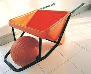
James Dyson is one of those designers who you see on television commercials and use their products almost daily, but never realize how big of an impact they have on the evolution of product design. Born in England, Dyson attended the Royal College of Art and majored in interior design, engineering and also studied furniture. Dyson based many of his inventions off the movement and mobility of the sphere, or ball. His brother is the one who originally thought of changing everyday objects with wheels into ones which used a singular ball. His first invention was in 1970 and was called the Sea Truck. The Sea Truck is a fast moving, boat like watercraft created to move equipment and supplies on water between plots of land or islands. The Ballbarrow, his first invention using his sphere concept, came about later on in life and was a wheelbarrow that used a large ball instead of wheels.
When in his Ballbarrow factory, Dyson became increasingly frustrated with the dust and filth that accumulated when using his standard Hoover vacuum. Although there was a huge market for vacuum filters and bags, Dyson knew there had to be a better way for the suction to occur within a vacuum. Therefore, he created the idea of cyclonic separation. The combination of centrifugal force and the small cyclones inside the vacuum enhanced suction without having a bag to cause clogging. In order to better market his product against the usual vacuum products he created the slogan "lose the bag" and attracted consumers who desired a fuss-free cleaning experience.
Many of the competing vacuum companies attempted to copy his seemingly amazing "bag-less" invention, but Dyson sued and won in both cases. Another extremely popular and fairly modern design of Dyson's is the Dyson Airblade hand dryer, which is actually seen here in many Ohio State University restrooms. It is both extremely functional compared to the typical hand dryer and very sustainable because of its replacement of paper towels. Instead of hot air simply blowing on the hands like a standard hand dryer, the airblade is unheated (energy efficient) and acts like a sheet of air wiping across the hands.
My favorite creation of Dyson's is the replacement of wheels with the ball. It amazes me that someone could think of a way for a product to move better than wheels. The wheel and axis is a fairly standard invention which has never failed and always is able to solve the problem of making a sedentary object have the ability to move. For an invention such as the automobile, wheels obviously are working fine. But Dyson saw a problem with the small scale version of four standard wheels on a vacuum cleaner. When cleaning the house and turning sharp corners around a table or couch, it is oftentimes difficult and a pain to clean every nook and cranny. A ball, on the other hand, as Dyson puts it, can turn on the spot. Although this seems incredibly simple and small scale, it works exponentially better and makes the weekly chore of vacuuming that much easier and enjoyable.
I personally enjoyed Dyson's work because of how he takes a product that is already created and even mass-produced and knows he can some how make it better. To me, that is not only difficult and challenging, but it takes a very marketable and confident person who knows they can change the mind and way of thinking of consumers across the board. This also impresses me because many of his inventions not only make products more usable, but more environmental. Less energy, less waste, less work. Dyson is the type of inventor who takes his own issues with products and improves them. He did not just let his own personal vacuum spit dust out and do a poor job at suctioning up the dirt on his floor, he saw the problem at hand and created a solution.


Works Cited:
Design_at_the_edge. Web. 17 Apr. 2011. <http://ic-pod.typepad.com/design_at_the_edge/2008/04/index.html>.
"James Dyson Biography - Life, Children, Wife, School, Son, Born, College, Husband, House, Time - Newsmakers Cumulation." Encyclopedia of World Biography. Web. 17 Apr. 2011. <http://www.notablebiographies.com/newsmakers2/2005-A-Fi/Dyson-James.html>.
"Google Images." Google. Web. 17 Apr. 2011. <http://www.google.com/images?hl=en>.
Milton Glaser very well may be one of the most simplistic and straightforward designers to ever make it famous. Although his name is not nationally recognizable or particularly well-known, one of his pieces is distinguishable worldwide. The "I Love NY" symbol is a creation of Milton Glaser's and is just one of his many iconic graphic designs. Glaser attended the High School of Music and Art in New York and furthered his education at the Academy of Fine Arts in Italy. In 1958 Glaser became a founder and later a president of Push Pin Studios. In 1968, Glaser became the co-founder of New York Magazine along side Clay Felker. Along with his noteworthy logo design, Glaser also designed the famous Bob Dylan poster and the "DC bullet" logo.
Glaser is best known for being authentic, uncomplicated and direct. He works with various mediums and multiple styles and has been known to use or work with anything to get the message across to the viewer. He is seen as one of history's most hard working graphic designers and has won multiple awards from distinct establishments such as the Art Directors Clubs, the American Institute of Graphic Arts, and the Society of Illustrators. Glaser designs everything form advertisements to book covers to drawings and illustrations in newspapers or magazines.
What intrigued me the most about Glaser was how easy his work seems but how difficult I know it had to be to come up with. The "I Love NY" symbol does not even seem like something that would need to actually be designed and up until this day I had no idea it actually even had a designer attached to it. The more I think about it, the more it makes sense. Its simple, eye-catching and laid out in a such a way that it can be used on t-shirts, coffee mugs and various other usable and wearable consumer products. Only a strategic and communicative designer could come up with a design that could become that outrageously popular and spread like rapid fire.

Works Cited:
"Milton Glaser Biography and Artwork - MetroArtWork." MetroArtWork - MetroArtWork. Web. 17 Apr. 2011. <http://metroartwork.com/milton-glaser-biography-artwork-m-218.html>.
"Milton Glaser - Biography." RoGallery.com - Online Auctions & Select Artworks Online. Web. 17 Apr. 2011. <http://rogallery.com/Glaser_Milton/Glaser-bio.htm>.
"Google Images." Google. Web. 17 Apr. 2011. <http://www.google.com/images?hl=en>.
Nate Duval - Short Bio
Nate Duval is a poster artist for many popular, alternative bands today such as Phish, Broken Social Scene, Wilco and Spoon. Growing up a huge music fan, Duval sees this artistic outlet as the closest he can get to being a rock-star. Although that career goal never seemed to work out, it was always a dream of his to make it in the music world. With album covers and CD art becoming an obviously less needed artistic field, promotional band posters for both new songs and music tours are becoming all the rage. Along with these posters come fan memorbilia such as t-shirts and bumper stickers which contain the same poster art.
The posters that Duval design are usually a limited edition, created specifically for the release of an artist or band's latest project. Since the posters are limited editions, they are a lot more likely to be considered collectors items by fans. This also means that the posters are a lot more intricate in design and work, and take a unique and creative twist by the artist that will specify the image to the work of music by the musician. With music being so quick and available to listeners via the internet and programs such as iTunes, the artwork that consumers used to see coincide with the music is almost lost with the advancement of technology today. Which is why these hip, trendy and visually appealing posters are a huge outlet for artists to get their piece of the puzzle shown in the music business shown.
What I enjoyed most about Duval's work was the uniqueness of his field in the artistic genre and how he has made a career out of interacting and working for the people he admires most. He saw a need for the promotion and creative aspect of music today and ran with it. Duval's work is eye-catching and intricate. It is not so simple where the objective of the poster is straightforward, but rather leaves you looking at the artwork for awhile seeing if there is anything you may have missed. His style is interesting to me as well because he uses paper and layers, sort of like a collage, then makes prints of his work. Everything is done by hand and then he sort of captures it in a picture. His patterns and color-use are appealing and visually pleasing.


Works Cited:
"Post Master - Boston.com." Featured Articles From Boston.com. 03 Mar. 2011. Web. 17 Apr. 2011. <http://articles.boston.com/2011-03-03/ae/29340497_1_posters-small-stakes-phish>.
"Google Images." Google. Web. 17 Apr. 2011. <http://www.google.com/images?hl=en>.
James Dyson - Long Bio

James Dyson is one of those designers who you see on television commercials and use their products almost daily, but never realize how big of an impact they have on the evolution of product design. Born in England, Dyson attended the Royal College of Art and majored in interior design, engineering and also studied furniture. Dyson based many of his inventions off the movement and mobility of the sphere, or ball. His brother is the one who originally thought of changing everyday objects with wheels into ones which used a singular ball. His first invention was in 1970 and was called the Sea Truck. The Sea Truck is a fast moving, boat like watercraft created to move equipment and supplies on water between plots of land or islands. The Ballbarrow, his first invention using his sphere concept, came about later on in life and was a wheelbarrow that used a large ball instead of wheels.
When in his Ballbarrow factory, Dyson became increasingly frustrated with the dust and filth that accumulated when using his standard Hoover vacuum. Although there was a huge market for vacuum filters and bags, Dyson knew there had to be a better way for the suction to occur within a vacuum. Therefore, he created the idea of cyclonic separation. The combination of centrifugal force and the small cyclones inside the vacuum enhanced suction without having a bag to cause clogging. In order to better market his product against the usual vacuum products he created the slogan "lose the bag" and attracted consumers who desired a fuss-free cleaning experience.
Many of the competing vacuum companies attempted to copy his seemingly amazing "bag-less" invention, but Dyson sued and won in both cases. Another extremely popular and fairly modern design of Dyson's is the Dyson Airblade hand dryer, which is actually seen here in many Ohio State University restrooms. It is both extremely functional compared to the typical hand dryer and very sustainable because of its replacement of paper towels. Instead of hot air simply blowing on the hands like a standard hand dryer, the airblade is unheated (energy efficient) and acts like a sheet of air wiping across the hands.
My favorite creation of Dyson's is the replacement of wheels with the ball. It amazes me that someone could think of a way for a product to move better than wheels. The wheel and axis is a fairly standard invention which has never failed and always is able to solve the problem of making a sedentary object have the ability to move. For an invention such as the automobile, wheels obviously are working fine. But Dyson saw a problem with the small scale version of four standard wheels on a vacuum cleaner. When cleaning the house and turning sharp corners around a table or couch, it is oftentimes difficult and a pain to clean every nook and cranny. A ball, on the other hand, as Dyson puts it, can turn on the spot. Although this seems incredibly simple and small scale, it works exponentially better and makes the weekly chore of vacuuming that much easier and enjoyable.
I personally enjoyed Dyson's work because of how he takes a product that is already created and even mass-produced and knows he can some how make it better. To me, that is not only difficult and challenging, but it takes a very marketable and confident person who knows they can change the mind and way of thinking of consumers across the board. This also impresses me because many of his inventions not only make products more usable, but more environmental. Less energy, less waste, less work. Dyson is the type of inventor who takes his own issues with products and improves them. He did not just let his own personal vacuum spit dust out and do a poor job at suctioning up the dirt on his floor, he saw the problem at hand and created a solution.


Works Cited:
Design_at_the_edge. Web. 17 Apr. 2011. <http://ic-pod.typepad.com/design_at_the_edge/2008/04/index.html>.
"James Dyson Biography - Life, Children, Wife, School, Son, Born, College, Husband, House, Time - Newsmakers Cumulation." Encyclopedia of World Biography. Web. 17 Apr. 2011. <http://www.notablebiographies.com/newsmakers2/2005-A-Fi/Dyson-James.html>.
"Google Images." Google. Web. 17 Apr. 2011. <http://www.google.com/images?hl=en>.
Subscribe to:
Posts (Atom)